"The partnership of Van Alen Institute, National Parks Conservation Association and Columbia University Graduate School of Architecture Planning and Preservation invites designers worldwide to play a vital role in Gateway National Recreation Area's future by generating innovative, visionary and compelling proposals that celebrate the unique potential of the park as both a significant regional resource and a national environmental treasure.
...
This is an open, international competition that requires the digital submission of anonymous design ideas for Gateway National Recreation Area. Members of a distinguished and diverse competition jury will evaluate the submissions in May 2007. The jury will select first ($15,000), second ($10,000) and third ($5,000) place winners as well as multiple honorable mention finalists ($500). Winning entries will be presented to the National Park Service for potential inclusion in the next planning phase of Gateway's General Management Plan, which is scheduled for 2009."
1.31.2007
Public Design Competition
Posted by Shin-pei at 12:54 PM 0 comments
1.29.2007
This Place Is...
I've joined Alexa and Seth over at This Place Is..., a blog Wander over there and browse around. My first post is about how the Willoughby closed street/public square experiment in Brooklyn is faring in the winter weather.
BttN will still be updated. I'm please to be able to have a sibling blog to round out the picture.
Posted by Shin-pei at 10:28 AM 0 comments
1.26.2007
LOVE this art
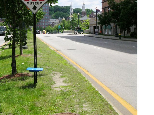
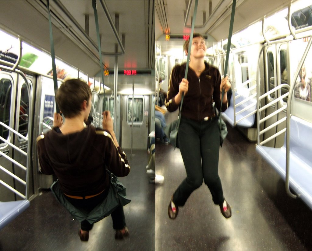
I LOVE this artist's work. There's such an exuberance for the daily public space that we all use without really thinking about it. Remember the name: Caroline Woolard. She's behind this seating:
this subway swing:
You can see updates on her work on her blog.
(via I (heart) public space, design trust blog)
Posted by Shin-pei at 10:31 AM 3 comments
1.25.2007
Backyards

This is what backyards look like in a dense, bustling city. Despite the many structures, it's actually pretty quiet back here. But it's never lonely.
Posted by Shin-pei at 2:48 PM 0 comments
1.24.2007
Being neighborly
This is part of my walk to the subway every morning. That coffee guy is just fantastic with the cheapest prices around, the guys at the hardware stores are often accepting shipments and joking around, and across the street is the nicest post office store, Post-Al. You can bring whatever you want shipped and they will package it up very nicely and mail it for you. It's about a thousand times better than being at the post office. They also love dogs in that place.
What people often avoid thinking about in this neighborhood are the many people heading out of the shelters every morning, or those who don't make it into the shelters. I was reminded of this, with the pending lawsuit against the homeless people trying to take advantage of the heat vents against the cold, in the Upper East Side. In front of the subway entrance, there's an kind of big air duct, and a quiet guy has been sleeping there these past few nights, since winter seems to have arrived. But no longer - I think these were put in as recently as yesterday. The spikes had a fresh coat of paint.
Note the pre-existing spikes on the pipes next to the vents - a nasty looking trio of no-sits!
People who do know that there are shelters near my apartment often ask me if I've ever been bothered by the folks who need to stay in the shelters. The truth is not even once, and I do see and have to interact with a lot of them, as we have to share the sidewalks and public spaces in our micro-nabe. There are better ways of treating people and our spaces than putting out spikes - literally or figuratively.
Posted by Shin-pei at 10:29 AM 1 comments
1.23.2007
graffiti/art

Public art idea for suburban malls?
Apologies for things being a bit slow around BttN of late....the re-design is in process, hurray.
Posted by Shin-pei at 10:48 PM 0 comments
1.17.2007
Storefronts, mostly old

This must be a flickr day. If you missed the Gothamist post about forgotten storefronts, the gallery is a must see.
It brought to mind the question, what makes these storefronts more interesting than the average big box. It's fun to look too, as there is such a broad collection.
The comparison may be obvious for some, but note that many of the "lost" storefronts in the gallery defy convention of successful retail merchandising - many of their windows are covered with dingy posters that obscure the interiors and they are dark, definitely under-lit. I would like to think that part of the reason these storefronts are still appealing to our senses (other than the beautiful texture and type afforded by the skillful photography) is that they are human-scale. Windows are at an accessible height. The scale of the store opens itself up to the sidewalk, and therefore pedestrians. Note the many people sitting outside the storefronts in this collection, taking in the street view. I have often walked by the Mars Bar, which is visually impenetrable, yet extraordinarily friendly to the street, so friendly that the BBQ held in front of it is not an impediment, but just part of the street activity and a connection to the bar. I have rarely seen people lounging around a big box, have you? And for those who like to over-police public spaces, this is kind of lounging that you do want.
Just some thoughts in light of the recent NYT article about big boxes retail chains taking over the city.
Posted by Shin-pei at 2:52 PM 0 comments
Community-driven logos

One of my favorite organizations is Architecture for Humanity. I sent around their logo competition to a few design friends, but neglected to post about it here. Then it slipped away until now - the final logos have been chosen. Take a look!
The winner will be announced in the next issue of AfH.
And it looks like AfH will be at MAS (pdf) at the end of January.
(via designboom)
Posted by Shin-pei at 1:26 PM 0 comments
1.14.2007
Lincoln Center magic
I got to see the Julie Taymor staging of The Magic Flute this past weekend. The somewhat surreal spectacle on stage was gorgeous and seemed to matched the magical glamour of Lincoln Center itself. I know the actual square was once a disaster area, but lately it seems the square has flourished, perhaps benefitting from the activity that has been growing in the immediately adjacent neighborhoods and the programming that happens in the square during the day.
I love that you can see so many layers of the building's interiors as you approach the entrance. Readers also know that I love what I call the messiness of modern structures when they are well-used by people.
Posted by Shin-pei at 9:39 PM 0 comments
1.08.2007
Universal design

I loved this NYT article (by my good friend Lisa). It just underscored the fact that it's difficult to get people to understand that good design, which should encompass universal design principles, should not be an exception, but the rule.
I've been knocked off my feet with a deadly cold, so I didn't get a chance to think back to the panel, on green urban environments. Thanks to all those who came out! It was a full house, and lots of fun.
The universal design article reminded me that as a panel, we didn't get a chance to talk about a lot of things, especially since the discussion seemed to be about green design in general, not about green urban design. Also, I was on a personal kick about not advocating for specific design proposals, and was more focused on the idea that sustainability is a lifestyle decision, so I loathed giving out specific design criteria. However, there are some low hanging fruit, especially for NYC. They include tweaking our roads for people, not cars; adding green roofs (how many times do you go up to someone's roof and are blinded by a sea of silver sealant?), and improving public transit connections. While these are more policy oriented, they impact the ongoing design of the city.
Obviously I'm having panelist remorse, but at least the thoughts are going somewhere.
Speaking of integration of good design, this is a related topic - the terrible state of packaging design for "better" food products.
Posted by Shin-pei at 4:15 PM 0 comments